Friday, May 4, 2012

CHAPTER VI: RHYTHM

In this Chapter of my Online-textbook/Blog.
We will explore the Design Principle of RHYTHM.
People will mostly associate the term Rhythm with Music an sound.
See the true definition of Rhythm is: movement or procedure with uniform
  or patterned recurrence of a beat, accent, or the like.
But in this aspect of Design an artwork, the term meaning is:  a patterned repetition of a motif, formal element, etc., at regular or irregular intervals in the same or a modified form.
With that being said, When a visual experience actually stimulates our other senses the effect is better Known as:KINESTHETIC EMPATHY. 
You can see the example of this in (A),

EX:-A- D., Cameron. Mirror Tower. Digital image. Censemaking.com. Web. <http://censemaking.files.wordpress.com/2011/08/bundestag-4-of-62.jpg>.
With other forms of design rhythm are SUPERMATISM which is an early Russian form.
Showing more structure with metal an industrial materials. With in a loose rhythmic kinda pattern. Mainly thru VISUAL Rhythm we can see movement an repetition,
as the art work seems to move in its own way an creating a loop pattern that draws the viewers attention to a kinda "dance", if u will.
Not only do NON-OBJECTIVE shapes produce oscillating rhythm.
AS shown in photo (B) you can see How the pattern flips between the black&white as well
as the objects flipping between fish an geese.

EX:-B- SWIM/FLIGHT. Digital image. Aaronkonopka.wordpress.com. Web. <http://aaronkonopka.files.wordpress.com/2009/03/birdstofish.gif?w=300&h=298>.

Shapes&Repetition: 
In the way we view shapes an patterns, repeated flow that seem to convey a since of movement.
In music, sum rhythms are called LEGATO, or connecting the Flow.
as u can see in (C) how the night lights form of an Aurora Borealis in a black an white setting. 
Seem to come down in a flow, like its jumping off the clouds back an forth.
EX:-C- NIght SKy Meet Sand. Digital image. Greenstoneart.com. Web. <http://www.greenstoneart.com/assets/LegatoRhythmStudy.jpg>.
Patterns&Sequences
This rhythm consist of successive pattern in which the same elements reappear in a regular order. In a design or artwork this way is called ALTERNATING RHYTHM.
As shown in (D), U can see how the photo express this term, as where the dark strokes against the light strokes twist an turns to form a flowy silhouette of dancers, without detailing on facial expressions or strong body features. The image still able to show an relate to dancers movement.
 
EX:-D- Stroke Dancers. Digital image. Redbubble.com. Web. <https://blogger.googleusercontent.com/img/b/R29vZ2xl/AVvXsEhV4oioeISqH623111I9V-Ji1keqaHPlvx1QsYQJx2q3Jfc2Tnec-NLv4HhC4DnjWdqYwYucbIW80B4YGDz_dhXv0Vo-LpyVGH7gakzZQf7TE23S-X7pGZBKrS38HcDZOpUYpQM4bgxRHQV/s1600/fredhatt-2008-modern-dance.jpg>.

Converging Patterns:

 PROGRESSIVE RHYTHM.
This term also involves repetition, a shape that changes in a regular manner.
in a small format of sequential patterns. Its very familiar to us, in ways of buildings,
from different angles. Where the perspective changes the horizontal & vertical into a converging pattern, as it create a since of the building diminishing in size.
AS shown in (E) you can see how the building, from this angle, seems to diminish in a sense
going smaller in size as you continue to look further down.

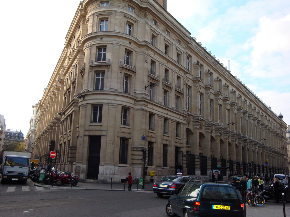
EX:-E- Notre Dome Bulding. Digital image. Novocin.com. Web. <http://www.novocin.com/france/paris/pics/parisangle.jpg>


Most complex form of Rhythm, is said to be  POLY-RHYTHMIC STRUCTURES.
Its more of an overlay of several rhythmic patterns, coming together as a whole an producing complexity with in the artwork structure.
 AS u can see in (F), this painting by Cassius Coolidge
Where the vibrating colors, an the smooth overlay of
the light source that's coming from the lamp,
mixed with the plain but contour color of the wall in the background with the 
painting an the grandfather clock in the corner, all
mash well with the different types of canine an there facial expressions
with the color of the card table an chips.
All have there own rhythm creating a unique picture
which contains all the design principles we've learn in class thus far.


EX:-F- Coolidge, Classius. Dogs. Digital image. Brandfreak.com. Web. <http://brandmediaweek.typepad.com/.a/6a00d834519bc269e2010537100bd8970b-600wi>.

Thursday, May 3, 2012

CHAPTER V: BALANCE

In this chapter, we explore another Principle of Design.
Which is BALANCE. This is a key point in life that we all wrap our 
perception around. From everyday activities, to daily career assignments
we look to balance not to IMBALANCE.
U don't sit in an uneven chair an say, "OK this is kool, I can dig it!"
U will either straighten the chair out to level it, or get a new one.
So with in Art&Design you look for a sense of EQUILIBRIUM in your projects,
because its subconsciously embedded with in us.
         Which is why there are many levels of Balance with in designs and 
artwork to create new point of views an different visions, 
while keeping them balanced. So some artist will try to create an 
imbalance piece on purpose, to express an uneasy tone,
or curious thought of "WHY?" does this artwork not seem RIGHT.
Here's some examples of Balanced work, to Imbalanced work. 
In (A) & (B) I'll let  you figure out which one is Balanced an Imbalanced.
  EX:-A- Balance Sphere and Cube. Digital image. Visualphotos.com. Web. <http://www.visualphotos.com/photo/2x2648314/Computer_Art_Image_of_Cube_and_Spheres_Balanced_on_CYB20073.jpg>.


 EX:-B- Awkward. Digital image. Blog.outhousestudios.net. Web. <http://outhousestudios.net/blog/fieldfittinglrg.jpg>. 
Thru Horizontal & Vertical Placement, within painting an designs the balance an imbalance 
is shifted to alter our view on the artwork to emphasis what the artist or designer is trying to convey there meaning or interpret there artistic view to there audience. 
Also forms of balance is ASYMMETRICAL, SYMMETRICAL or
BILATERAL SYMMETRY.
As you can see in (C) this is a form of symmetrical balance, where the artwork
is mirrored by the left an right. As to be a perfect over-all picture.
An with in (D) is a good example of asymmetrical balance, where the piece is NOT
mirrored but more of realistic as seen where not everything nature is completely alike from Left&Right side. Asymmetrical means different on both sides.

EX:-C- Garden Risen. Digital image. Idevelop.ie. Web. <http://www.idevelop.ie/igarden/images/spaceball.jpg>.


EX:-D- Balanced Rocks. Digital image. Gatlineducation.com. Web. <http://www.gatlineducation.com/demo/ResInteriorDesign/images/L11-03.jpg>.
The main are where you'll find most symmetrical or STATIC, is with in Architectural Designs. To create perfect or close to perfect balance with in a landscape or building.
Which also highlight another form of balance, which is by VALUE&COLOR.
Even thru negative value as to reverse lighting an show the color side as negative darkness.
but, formulated to show balance with in the design, Most form of using this is called SILHOUETTE. Where the main focal points of interest are darkened or shadowed in away where just there outline form is visible against a colorful or brighten background. 
As shown in (E).
Another form of balance is by TEXTURE & PATTERN , like thee example shown in (F). 
Which is a form of balance I can see being used a lot in Fashion Design an Interior Design.

EX:-E- KungFu at DUSK. Digital image. Picturecorrect.com. Web. <http://www.picturecorrect.com/wp-content/uploads/2009/11/silhouette-photography2.jpg>.  
EX:-F- Plaid & Dots. Digital image. Corporette.com. Web. <http://images.thesartorialist.com/photos/2249plaiddotsDetailWeb.jpg>.


Tuesday, May 1, 2012

CHAPTER IV: SCALE&PROPORTION

In this Chapter of Scale & Proportion.
We will explore the How this Principle of Design is also essential in Creating original,
or recreating an expanding designs.
For Instance, one position of this is called HIERATIC SCALING.
Where this way emphasis on larger figures in a piece of Artwork or design
showing there importance. As Shown in (A) where We see, even tho Christ is proportionately the
same size as the other men, in human scale, he's standing in different clothes
with light emphasizing his Hieratic Scaling of importance.
EX: -A- Jesus Christ. Digital image. St. Judes Pilrgam Shrine. Web. <http://www.stjudetvm.com/gallery/last_supper.jpg>.
Scaling can also be used to bring attention to an Object which is normally of smaller size an insignificance.
While pushing the proportion size to a larger or extreme measure, it emphasis what the Artist is bringing to our attention in ITs own importance which makes it stand out, an becoming significant in its own way.
Shown in (B)You can see How big the coffee mug is.
When in normal reality size its about 20xs smaller. Can U imagine drink in a cup of coffee this big, i love coffee. But couldn't handle this size in one drink, I would be extremely Hyper an drive Terina crazy.
But the artist used Scaling n Proportion to show its significant importance to him/her.
As well as using the houses an tree landscape in the background to emphasis on its larger size.
EX:- B- Big MUG. Digital image. RoadFood.com. Web. <http://www.roadfood.com/photos/3762.jpg>.
Another Art form that specialize in Scale & Proportion is EARTHWORK.
when an artist or team of artist, design artwork using Large scale Landscapes or even Farm land, which most famous art been done using that pallet is known mostly as "Crop Circles". Such as seen in (C) of Amelia Earhart, the Famous Pilot.

EX:-C- Amelia Earhart Earthwork. Digital image. Getruralkansas.com. Web. <http://www.getruralkansas.com/townassets/1/earthworks02.jpg>.
Thru Contrast of Scaling, an artist can emphasis on the design piece thru unexpected or exaggerated proportions. Like, also seen in (C). But thru design work like magazines an media publications, the exaggerations of large scale models of an object that's in reality extremely smaller then it is, as shown in (D).
How this enormous pineapple is as tall as the palm trees its placed next to.

EX: -D- Pineapple House. Digital image. Ofmiceandramen.blogspot.com. Web. <https://blogger.googleusercontent.com/img/b/R29vZ2xl/AVvXsEhOfFuUp-beQO2OQpVIWxnenAgGPHsYveY-nUWjTnjsXu6eHpUeTgHcNhDevAZa73I-h1rpYdBaoYttNdFYnG5rtOQ0By6DmaM_B_CK_l2hMW2NaDpbQfI-w7-fPydYuqg2CO4QkQ4aO9Eb/s400/pic3.bmp>.

 Another form of Scaling & Proportion thats used in artwork to describe an artist view.
is thru SURREALISM. in which a piece of artwork is mainly based on images that can not be explained on rational terms. Most artist who work in this form, presents thee irrational world of Dreams or nightmares.
As u can see in the photo in (D)
Ex:-D- Jade, Lara. Faceless Madian. Digital image. 1stwebdesigner.com. Web. <http://cdn1.1stwebdesigner.com/wp-content/uploads/2011/03/photo-manipulation-surrealism16.jpg>.
One method Formal artist still like to use to this day, is called the GOLDEN RECTANGLE.
Where the portions of the golden rectangle can be expressed in the ratio of the parts to the whole.This ratio, is referred to as the GOLDEN MEANS. Both the entire rectangle created and the smaller rectangle attached to the original square are golden rectangles in there proportions.
here are 2 examples of photos that use an express the ratio mark of this rule.(E),The Famous Mona Lisa. (F) painting by Monet.

EX: -D- Da Vinci, Leonardo. "Mona Lisa." Jwilson.coe.uga.edu. Web. <http://jwilson.coe.uga.edu/EMT668/EMAT6680.2000/Obara/Emat6690/Golden%20Ratio/image49.gif>.

EX: - E- Monet. Little Girl Wants. Digital image. Teacherlink.org. Web. <http://www.teacherlink.org/content/math/activities/skpv4-goldenrec/images/monet.jpg>.


Monday, April 30, 2012

CHAPTER III: EmpHasis

An Artist wants to capture attention in his artwork or Design.
In this chapter of my book, I'll show how the Emphasis in different works of Art.
Capture the viewers attention thru Focal points, by Variation of emphasized techniques.
EX: -A- Car with USB. Digital image. Gadgetsin.com. Web. <http://gadgetsin.com/uploads/2012/02/new_mini_cooper_usb_flash_drive_5.jpg>.  
As shown in (A) how the designers focal point is placed
center an balanced with color an design.
As he captures your attention with his work,
he also allowed in one piece to convey his point across of his Marketing ploy.

Another way to display emphasis is by PLACEMENT
Emphasis by placement , can be drawing attention to the center, to be establish a connection
of meaning of the artwork or Abstract, Depth between the Artist mind and viewer.
AS shown in (B) Emphasis by Placement, as the Main character is specifically place to the left of the picture with the magnificent design in the background giving him more of an luminance presence  as a important Figure in the story containing him.

EX: - B- Assassin Creed 2. Digital image. Swift Attack. Web. <https://blogger.googleusercontent.com/img/b/R29vZ2xl/AVvXsEhfbmmFEFu3PyZUlf9bXwiDQUcspu5JJHhrlonHfZLHr8a2RczqwMGGWvbLkc7NhECrOV4ivH16LmHHcOyUavk97ERfejhWw-uvSYDjRRaN0lBaoT6VQdNiYSSY-_OeGNBM-FL1djDbjLo/s1600/assassins-creed-2-xbox-playstation-ps3-1-wallpaper-r3ym.jpg>.    

Other focal Point techniques that express Emphasis, are Emphasis by ISOLATION.
as shown in (C) u can see this example, by the way the designer isolate the main character
in the foreground with what appears to be people in the background.
yet Blurred, to put more emphasis on the main character also by placement.
thru positioning him on the Left of the Picture as a whole.

EX: -C- Assassin Creed 2. Digital image. Playstation 3 Games. Web. <https://blogger.googleusercontent.com/img/b/R29vZ2xl/AVvXsEhq2GQS7ukOlfAZsyOkBo2Szh10LZz88euJWZbs6HCgUWllMNFVN7t7jBRQw71LDf7G5BfwmNa-D0-Y5jxbssZnEEe3vZv319EaExynQ-CW_8QKuFon9jh39MDh4x1U9spjOhbB8CvG3P8/s1600/assassins-creed-wallpaper-2.jpg>.


CHAPTER II: UNITY

UNITY within artwork is formed thru Ideas, Visuals, an Pieces of Objects use of Artwork material or random objects that show some form of similarities.
Be it, very obvious or even minute.
Be it, Harmonic Unity, Visual Unity, or Intellectual Unity.
AS shown in the picture below in (A) is unity piece together, showing action .
EX: -A - "Marvel Ultimate 3." Comic Wallpapers. Web. <http://comicswallpapers.net/wallpapers/full/628848437.jpg>.

Most use a COLLAGE Shown in (A) to capture thee effect of Unity.
While others may use the different objects, different shapes,
But links them together by the same unique contrast of color or topic to show unity.
 Most unified compositions are one of the same nature,
Texture, Objects, just different size or color.

Some can also show unified conflict, as well as unified balance.
Looking at a city skyline from this view.
You can see how the bridge an skyscrapers an smaller buildings,
group together in a particular order shown in (B)
Yet, the unique placement see
Showing visual unity, making it distinctive from other cities.
Also Showing Chaos&Control.


EX: -B- GTA 4 Wallpaper. Digital image. Web. <http://bto.boo.jp/pclife/img/2-3.jpg>.


Another form of Unity is CONTINUATION, PROXIMITY, REPETITION.


As Shown in (C) the design displays these 3, as you can see
the Main character sitting being the focal Point of the design.
an the Creatures launching from behind him in the background,
in a aggressive motion.


The Darkness 2. Digital image. Gamez Mentor. Playstation 3. Web. <http://www.gamezmentor.com/wp-content/uploads/2011/11/wallpapers-of-the-darkness-ii.jpg>.


CHAPTER I

In this 1st CHAPTER we will explore the act of LOOKING,THINKING,DOING with in the process of design. As in the examples, will be displayed..
In this example Below, We show how this design express the art function of THINKING to the viewer.

In this 2nd photo, we show the 2nd function in an artist mental. of LOOKING!
Coming from the Artist own visual perspective, Of how he see's an object,
or project thru How he incorporate his own views thru the Design an How its
relaying his message.


Now In the 3rd we show, DOING!
The Act of DOING! to an Artist, in the process of creating, an Re-Creating an Original
Idea. After thinking, Looking,Then Doing Aren't always the 3steps to a Final Projects Completion.
But sometimes it can be the start to a rough draft, or 1st attempt.
By doing, a true creative artist can be inspired by his own creation.
To re-create or add-on to the desired project he has foreseen in his vision.
Thus causing most artist ti overlay there artwork upon another
which is called "Pentementi".
But for a designer process in terms of creating  for a client.
The process of DOING expands to creating numerous ideas to either "pick&Choose" or feed off an take pieces from his own rough draft mold together an create a complete New piece of ArtWork/Design.